EPA.gov discovery of user pain points case study
THE PROBLEM:
Users are having difficulty finding information via the current menu navigation structure.
THE SOLUTION:
Improve the main navigation by adding a new category and drop down menu, so that a user can find an article or page without navigating multiple pages. Extra: Update the overall look of the site.
MY ROLE:
UI/UX Researcher/Designer
TOOLS:
Figma, Adobe Xd, Miro, Zoom, optimalworkshop.com, index cards
User Interface Analysis
Users were tasked with finding the page about mold cleanup for their home.
Testing found that users were not clear on where to click to find the information that they were looking for, due to the lack of a signifyer in the main navigation that there was a dropdown containing more topics. The category “Environmental Topics” didn’t suggest a clear path.
It was observed that, all testers, after a quick scan of the page, defaulted to the search box. The search box results tended to be a little daunting due to the sheer volume of articles that appeared. And if they did click through from the main category dropdown, it would lead to a convoluted path to the target page.

A card sort was conducted on optimalworkshop.com to determine what the best category title should be. A total of 10 users participated.
Findings:
“Home Health” edged out Healthy Home as the top choice for the new category in the main navigation bar

Heuristics homepage analysis

Heuristics target page analysis

User flow

Proto Persona

Feature Matrix

User Persona

Style tile

User Interface Design
Lo-fi wireframe testing if a new category will help guide users to information before they try the search box. Improved dropdown, to reduce the number pages that have to be loaded to reach a particular destination.
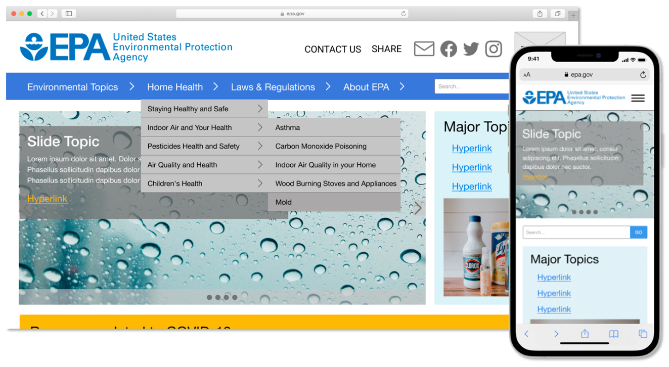
Proposed header navigation

Proposed navigation change: Adding a new category to the navigation bar. Expandable dropdowns to help the user find what they’re looking for before they have to open a page.
Wireframes

Navigation ideation sketch

Proposed Style Guide

Hi-fidelity prototype


Key learnings and takeaways
The Environmental Protection Agency’s site is full of a lot of useful information that is accessed by a wide range of users; from the homeowner, journalist researcher, industrial managers, scientists, and everyone in between.
The existing navigation is not inviting to the user and they tend to jump right into the search box which yields a multi-page long list that they have to wade through to find what they are looking for.
After testing we propose that a new category header “Home Health” be added to the top navigation bar and arrows next to the category title indicating the existence of dropdown menus.
Read the Google slide deck
Return to my portfolio